Nokia changed its logo after 60 years, CEO said – Now mobile business is not the identity of the company, focus on these areas.
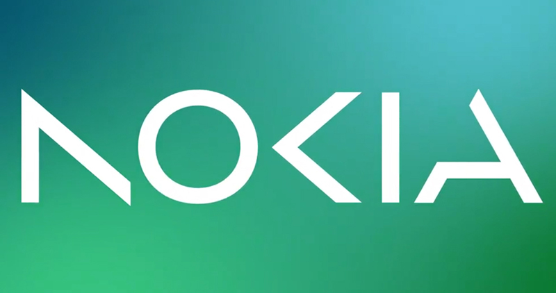
New Delhi, Business Desk. Nokia New Logo: Nokia, once the world’s top mobile phone company, on Sunday announced plans to change its brand image. This link company changed its logo for the first time in 60 years. NOKIA is written in different letters in the new logo of Nokia. In this, many other colors have been used along with blue, pink, purple, while earlier the company logo was only blue.
Focus on technology business
Explaining the new logo, the company’s CEO Pekka Lundmark said in an interview on the eve of the Mobile World Congress (MWC) in Barcelona that it used to show the company’s association with smartphones, but today the company’s business has changed. Gaya is associated with the technology sector. The image of Nokia in a lot of people’s minds right now is that of a successful mobile brand, but Nokia is not that.
Further added that a new brand focusing on network and industrial digitization, which is completely different from legacy mobile phones.
Mobile business with HMD Global
Nokia brand mobiles are being sold by HMD Global. HMD got the license after Microsoft, which bought Nokia’s mobile business in 2014, stopped using the name.
Company in the business of Telecom gear
The company has focused its attention on the service provider business, in which the company sells 5G gear etc. to telecom companies. Last year, this business grew 21 percent, accounting for 8 percent of total sales, or 2 billion euros ($2.11 billion), Lundmark said.
Along with this, the company is also partnering with the world’s largest telecom companies to provide 5G gear. Lundmark said India is one of the fastest growing markets for the company. The second half of 2023 in North America could prove to be good for the company.


